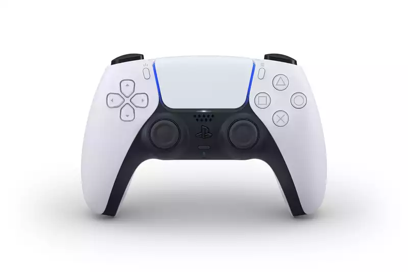
When Sony announced the PS5 dual-sense controller, I thought it was a pretty ugly contraption. I took a survey of my colleagues to see if I was the only one, and about half of them agreed with me. The two-tone color scheme, the redesigned grips, and the all-black PlayStation buttons were certainly futuristic, but they looked more like Neuromancer than Star Trek, and seemed a bit clunky to me.
Now that I've had a few days to get used to the controller, my view has softened a bit. Especially since I think the vertical grip will ultimately make the device more comfortable. Not all fans were happy with it as is, however. Some digital artists added their own twist to the DualSense and shared their work with the online community.
None of these DualSense concepts will hit store shelves anytime soon, but it's fun to think about what might have been and what variations Sony might create later.
One of the most beautiful renderings is by Nikolay Mochkin, who goes by "Ellejart" on Instagram; Mochkin has created a short video of the DualSense with illuminated buttons, which is a nice touch. Unlike Sony's controller, Mochkin's is gray and black, not black and white. But the bigger difference is that Mochkin's buttons glow: all of the buttons on the D-pad are subtly underlit in blue, as are the touchpad and PlayStation buttons. The triangle, square, circle, and X buttons light up green, pink, red, and blue, respectively, similar to the color coding on older PlayStation controllers. However, while attractive, such a setup would actually drain a lot of power.
One of the most popular dual-sense fan designs (at least according to Reddit) is the "golden dual-sense" by an artist named Iésu, who goes by "itsalastor" on Twitter. This relatively simple redesign features golden highlights on the button and touchpad borders and a golden crosshatch pattern added to the grips. My guess is that this model resonated with people because it is elegant, but not as harsh as the default design. Gold and black are much easier to match than white and black.
A user named "dormstreams" came up with a novel DualSense design on Reddit and created four different DualSense mockups using a Sony specific series. The God of War design is a red "Ω" symbol on a white background. The Spider-Man design has red webbing and a white logo in the center. The Last of Us design is dark green with a black firefly symbol in the center; the Horizon Zero Dawn design is blue and gray with a faint outline of a robotic beast on the grip. One can only hope that Sony will eventually release a controller like this so that the real thing looks just as good.
When looking for inspiration, sometimes you have to go back to the classics, which is why Reddit user "asgardian_mike" drew concept art for a PS1-style DualSense controller. This model has a black center, PS1-colored gray grip, multi-colored PlayStation logo buttons, and color symbol face buttons. There is a subtle blue glow around the touchpad, but otherwise it is as close to an old-school DualShock as you can get without changing the physical design of the DualSense.
The most ambitious DualSense fan concept is also the least realistic, for better or worse; Reddit user "SYROBONKERS" posted a short video of a black and white DualSense. Like other fan concepts, the button lights up. Unlike other fan concepts, it also has an interactive touchpad with LED display screen. In this fanciful rendering, the DualSense could also display notifications and battery life, or present the user with a small keyboard for typing messages. A number of commenters pointed out that such a contraption would be prohibitively expensive and would probably not add much to the experience, but what is the point of a fan rendering?


Comments