I want to like the new camera control buttons on the iPhone 16 and iPhone 16 Pro series However, based on my hands-on review of the iPhone 16 Pro, I am also torn about its execution
To be fair, I need to live with the new iPhone to make a final decision However, I left the Steve Jobs Theater with a fuzzy first impression But let's take a step back and consider What is camera control?
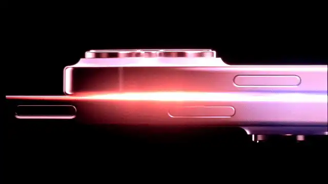
The camera control is not a physical button; it is a recessed tactile switch on the right side of the iPhone 16 series, with a capacitive sensor that provides a clicking sensation With this control, you only need to press once to start the camera and once more to quickly take a picture And if you want to start a video, just press and hold
But this is only the beginning of what you can do with the camera control Multiple options such as zoom, exposure, and depth of field can be toggled by sliding your finger along the buttons
This is the part that confused me a bit when I tried the camera controls I would skip over an option I wanted, or not be able to navigate to where I wanted in the menu A bit finicky Also, to switch between camera control options, you have to double soft press to bring up the menu It is like pressing Home
However, this can also be tricky I accidentally activated the camera control menu while zoomed in, and suddenly I was controlling exposure instead of zooming in Once I got the hang of it, however, I was able to zoom in and out with a simple slide of my finger, which was really satisfying
Thanks to Apple Intelligence, the camera controls will get better with time You will be able to fire up the camera when you are in front of a restaurant to get ratings and hours of operation, or point the iPhone 16 at a concert flyer to add it to your calendar
This very much mimics Google Lens and Gemini Live, which I accept In fact, Apple is working with third parties like Google for search and ChatGPT for solving math problems
My problem with the camera controls is that once you start digging into the functionality, it's not necessarily better than using the touchscreen The little buttons are not as precise as tapping on the iPhone 16 or iPhone 16 Pro display I wouldn't say it's as vestigial as the scroll wheel on the disaster that is the Rabbit AI device, but it reminded me of it
So for now I have a lukewarm impression of the camera controls They are a bit wishy-washy for my taste, but I won't know if they are worth promoting until I have used them for at least a week Then I will need to use the visual intelligence feature (when it becomes available) to make a final decision





Comments