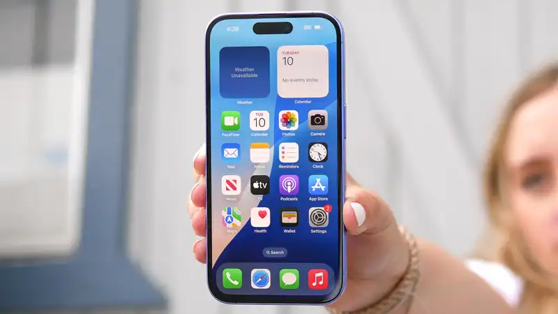
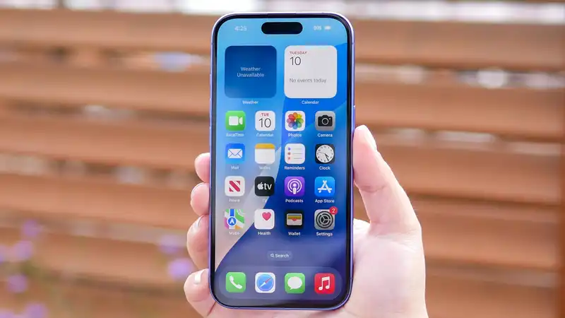
iOS 18 launched earlier this week, and with it came an impressive array of new features Of these, Apple Intelligence is clearly the most notable; AI is a hot topic, and this is Apple's chance to show exactly what it is capable of in the face of extensive competition However, this is not my personal favorite feature of iOS 18
Rather, my favorite feature is one I've been clamoring for Apple to provide for years now, ever since I first experienced the Android OS 13 years ago The implementation may be imperfect, but I love the fact that Apple is giving users the opportunity to have complete control over the appearance of their home screen, and where the app icons are placed
Back in 2011, when I first used an Android phone, there were many personalization features that made Apple's home screen look childish Not only did the app drawer mean that apps didn't have to be on the home screen and could be organized in some way, but there were even more options
Android's app icons could be placed wherever they wanted, without having to fit into an orderly list like they did on iOS until this year If you wanted to leave some space on the home screen, that was absolutely possible Some launchers even allow you to blank out the entire home screen, allowing you to admire your wallpaper without the foreground getting in the way In addition, Android had widgets that allowed one to see and do certain things without having to open an app
Over the years, Apple has gradually added these features to iOS, but it took a very long time to get there Widgets made a brief appearance in iOS 10, but it wasn't until four years later, in iOS 14, that they appeared on the home screen iOS 14 saw Apple launch the App Library, finally letting lost apps live in a place that was not the home screen The following year, iPadOS 15 allowed tablet users to place widgets anywhere they wanted
It wasn't until this year that this last freedom was extended to the iPhone, allowing users to customize the location of apps on the lockscreen And it's been an awful time too
There are many reasons why I have always shunned the iPhone over Android Some of them, like consistent back button navigation, have yet to materialize But the freedom to make my home screen look strange and disorganized to onlookers (while making perfect sense to me) is one of them
Nevertheless, this is a positive step forward, and Apple needs to fine-tune its implementation
The main problem with the new home screen customization is that the old system is still clearly in place While it is possible to move icons around and place them where one wants, the old grid format still makes an occasional appearance So if you move one icon, all the rest of the icons will move to fill the gap
From what I can see, this all has to do with the first square on the screen (below the time in the upper left corner) If an app icon or widget is there, everything you add next to it will automatically snap to the autocorrect grid format
This is Strange I understand that many people might prefer a grid system, but the freedom to place icons wherever you want means that you can always stick to a huge screen of app icons It's entirely your choice Trying to make both icon placement systems work together doesn't work well and means that someone could easily make a mistake and have to rearrange the entire home screen again
This little quirk reminded me that iOS 18 allows you to change the color of the home screen to a different tone, but you have to use the same color for all apps and icons Given that Apple has spent years limiting what is actually offered, it makes me wonder if they really don't understand the concept of “personalization”
But even if it means that Apple should continue to tweak the implementation of this feature, it is certainly a step forward
While Apple Intelligence may be the part of iOS 18 that gets the most attention, there are still many additional features in the update that are worth checking out Improved personalization is one such feature that Apple should have offered years ago Because if you can't make your phone truly personalized, what's the point?
Personalization of the home screen is incomplete and Apple is clinging to the old auto-organizing grid system Whether that is intentional or accidental, I don't know, but it is definitely the kind of thing that needs to be fixed in a future iOS update But for now, I'm glad it actually happened, even if it took 17 years Now if only Apple could find a way to provide a consistent back button






Comments