I recently downloaded the public beta of iOS 18 and took a look at it However, there are a few things I just don't like I am a long-time user of Apple products and have been since the iPhone 3GS I am a fan of Apple and the iPhone, especially when it comes to gaming on a phone where folding is clearly an advantage, although I sometimes get lost in the process That said, I wanted to give the new update a try and see how I felt about it
I must say that for the most part, the iOS 18 beta ran smoothly and I had no real issues with battery drain, crashes, or any of the other issues that are always a concern The issues I had were related to some menu choices and a visual design that was worse than previous updates
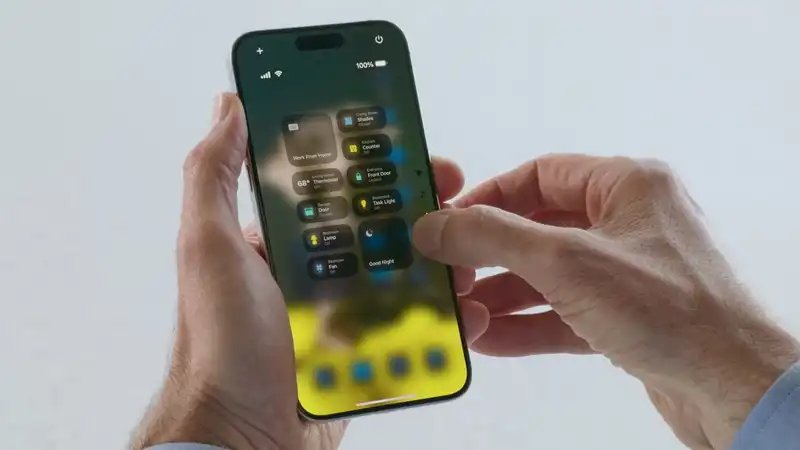
I spend a lot of time listening to music on my Bluetooth headphones, so I need to be able to easily connect to my phone in iOS 17, all I had to do was long press the widget in the control center to open the Bluetooth settings window However, in iOS 18, it is slightly more complicated, adding an extra step to either get to the settings page or turn Bluetooth off
Currently, to turn Bluetooth on or off, one must press the Control Center square and then the Bluetooth widget I also noticed that long pressing the widget does not bring up the settings menu, but instead brings up a mini menu, with a third option at the bottom to enter the settings menu This is a minor issue, but it made a simple action a little more annoying
Ideally, the new OS should streamline things or, if that is not possible, simply leave things as they were This change in the way the Control Center operates feels like it was added for the sake of adding it However, it does seem to take some getting used to, so hopefully it will soon become less cumbersome
One of the major changes brought as part of iOS 18 is a complete redesign of the layout of the Photos app In theory, this new layout is designed to make it easier to find a particular image or group of images However, the actual app is strangely cumbersome to navigate, and appears to hide what you want to find as well as being repetitive [For example, the previous Photos app was divided into two sections iOS 18's Photos app has a tab called “Recent Days,” which does not include images saved to the phone There is now a tab called “Recently Saved Photos,” but it is located at the bottom of the screen and is surprisingly easy to miss
This is the fundamental problem I have with the new Photos app It is convoluted and difficult to navigate For example, in the main library of the Photos app, images can be set to sort by date saved rather than date taken, but again, this is hidden Apple also decided to introduce a carousel, so you could accidentally move the library sideways If you happen to miss the little dot, you would have no way of knowing this is a possibility Apple's Genius Bar would be flooded with people who “lost” their photo library
All Apple needs to do is streamline the app and find the best place to put folders All the pieces are in place for a great improvement But my last issue is the one that concerns me more, at least personally
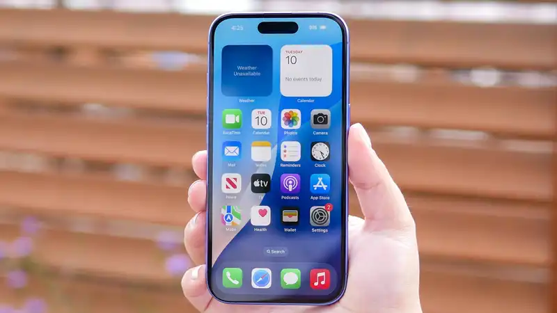
This is a more personal issue, but I know it's not just mine I hate the home screen widget tint option There is nothing I can do about this The problem is that because it is a single color everything looks the same For example, I tried to tint the widget red What actually shocked me is that the entire main element of the widget turns red
I thought third party apps were spared, but they are not If you've ever had trouble finding an app you remember downloading, wait until you have to do it when everything looks like a red blob of different shapes There are better ways to include shades in an app, and one of them is certainly not to cut out every color except the one you chose
One option would be to make only the background change; I know Apple has such a feature Adding tints should not be that complicated and could likely be easily fixed However, this feature is still new, so some issues are to be expected
This is the crux of my time with iOS 18, and while I have found things I dislike, I know it could change None of the issues I have found are game breaking and each is relatively easy to fix The immediate question is whether Apple will take the time to fix them
For more information on upcoming features, please see the full breakdown of new iOS 18 features mentioned in Apple's WWDC presentation We also show you how to download the iOS 18 beta version if you'd like to try out the features yourself






Comments