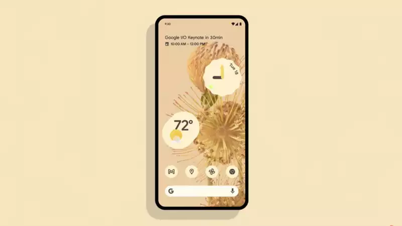
Android 12 is here and we know a little bit about what it looks like: at Google I/O 2021, the company unveiled its new Material Design, and it looks gorgeous; not since Android Lollipop at least seven years ago has there been such a big change in the UI; the new UI is a lot more than just a new look and feel
From the color palette that changes depending on the wallpaper to the all-new notification shade, Android 12 is more than an iterative update The Pixel phones, due out this fall, will look completely different later this year
Specifically, Quick Settings have also changed with much larger bubbles labeled; in Android 12, GPay and Home settings are now front and center instead of hidden in the power menu
Speaking of the power button, it can now be long-pressed to bring up the Assistant (like Siri on the iPhone or Bixby on the Galaxy)
Android 12 just got more exciting; stay tuned for more from Google I/O





Comments