We've already heard a lot about Android 12, and news about iOS 15 is imminent While the two operating systems have become remarkably similar over the past few years, there are still important differences that separate them If one is stronger than the other, the other is not far behind
I have already talked at length about what I think iOS is superior to Android and what I think Android is superior to iOS I myself am not platform-agnostic and regularly use both However, after Google released Android 12 and I got my hands on it myself, I could never look at iOS 14 the same way
After using Google's new OS in my hands-on beta review of Android 12, there are three things I hope iOS 15 will mimic Without shame, Apple should take what Google has done well and add its own twist to the basic principles of iOS With these things in mind, the iPhone 13 could be a truly amazing device with software that challenges the best that Android has to offer
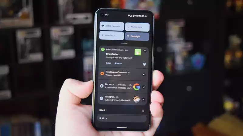
I have railed against how iOS implements notifications, mainly because they are not as good as Android's notification shade Not only is it sometimes awkward to reach to the left corner of the screen for fear of activating Control Center or Search, but on my iPhone 12 Pro, the tap gestures on the back are inconsistent
Managing notifications on Android is easy Whether it's clearing junk mail, replying to a Signal message, or getting information about news headlines or the weather, I do all my notification processing in the shade Not to mention that Google groups things into Conversations, Notifications, and Silent so that I always know what's going on It helps me stay organized and see what is important
iOS notification management is clunky, but Android 12 makes it even smoother than before; receiving a large number of notifications on a Pixel 5 running Android 12 beta is even easier than Android 11
Google has improved the notification shade, and Apple could take some serious tips from it Pulling down things like the lock screen is no longer useful, and the company needs to do better about how it sorts incoming items And for the love of all that is holy, a "Clear All" button that is always present and works for all items in the notification center would be nice, Apple
This may be a moot point, but Quick Settings is certainly superior to iOS's Control Center While both accomplish the same thing, access to Quick Settings is much smoother than the Control Center and has the added benefit of being associated with the notification shade This means that you can view and manipulate notifications while accessing the quick settings toggles and media controls
In Android 12, Google will change the Quick Settings menu to feature a larger toggle, which will eventually include a button to manually and temporarily disable permission for apps using one or both the camera and microphone This is something that cannot be done efficiently in iOS, and one must enter the settings menu to revoke permissions
The amount of things you can switch between in Quick Settings far surpasses what you can do in Control Center; in Android 12, Quick Settings also provides access to Home Control and Google Pay, further surpassing Control Center
Apple has also added a new feature called "Apple Control Center
It is long past time for Apple to rethink and possibly redesign the Control Center
This is because iOS is tied to Apple's vision, whereas Android almost always allows you to customize it to your liking Both have improved in recent years, especially with iOS 14, but Android 12 goes a step further with Material You
With Android, you can make your phone your own, but Material You goes beyond that Now, more than ever, the focus is on you, the user, and what you want, and Android will adapt
The biggest example of this is the new color theme system: Android will take one color from your selected wallpaper and apply it system-wide You'll see the color change in widgets, quick settings, and elsewhere In other words, if your wallpaper contains blue, the system will pull it out and apply it, providing a complement to what you already have
iOS, while allowing some customization, is relatively locked down However, Android offers more personalization, and iOS can easily implement more design changes to make users feel more like themselves with their iPhones
Android 12 is the first major OS change since Lollipop in 2014 Google is not holding back, taking refinement to several levels over the past few years If Apple isn't careful, iOS 15 could lag behind Android 12 in terms of features and functionality Whatever you say about either platform, Apple could take a few pages out of Google's book
We'll have to see what Apple has planned for iOS 15 at WWDC 2021, which opens on June 7 It is possible that Apple is already one step ahead of us, as we have already heard several rumors about iOS 15 regarding improved notifications and other upgrades
Android and iOS will never be the same, and that's a good thing But there is a difference between being on opposite sides of the same coin and taking advantage of what the other is doing well





Comments