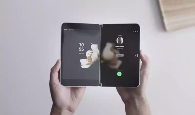
Microsoft Launcher is the soul of the long-awaited Surface Duo, the folding phone Redmond doesn't want you to call a "phone" And now you can try it out on your Android device
The new Microsoft Launcher is available now as a preview app in the Google Play Store, a brand new code base developed with the Surface Duo in mind
Obviously, this version lacks many things found on the Duo This version does not test the dual-screen support that is the biggest selling point of the Duo user experience It also does not have access to all of Microsoft's custom apps that come with its hardware devices However, it is a good glimpse into Microsoft's direction
I installed Microsoft Launcher Preview to temporarily replace my favorite Android launcher (the minimalist Evie) So-so
It feels like every other launcher I've tried It's polished and has some nice features like dark mode support and landscape mode It shows that thanks to the fluid nature of Android 10's interface, the upcoming hardware will be able to operate in any orientation or screen combination
But that's really about it in terms of what's "new" other than landscape mode
Don't get me wrong Especially considering this is something of an alpha release But if you were expecting a completely new and surprising user interface paradigm, like Windows Phone's excellent UX, you're going to come up empty The launcher looks and feels exactly like what I saw at the Microsoft event last fall
For me, it was a disappointment I had expected Microsoft to create a skin based on Android that would fit the Microsoft Surface experience In fact, I had hoped that Microsoft would surprise us with the re-launch of Windows Phone
Despite its shortcomings (mainly the lack of apps and some inconsistencies in the way services are integrated), the Windows Phone UX remains the most innovative and useful interface in cell phones replacing the icon grid design of the 1990s, active, uncluttered, and fully customizable views were adopted, giving users direct access to the information they needed without having to open an app
Unfortunately, however, that is not what we are getting
The launcher has a tray that can be accessed by moving your finger from the left edge of the phone From here you can access three panels:
The first is Glance, which displays all the information you need You can access calendar appointments (there is also a Create New button), mail, messages, and notes, and you can integrate with Microsoft services and native phone services
The second is News, which is really Microsoft News It is also linked to your Microsoft account so you can have customized feeds that suit your preferences
And last is Timeline, another Microsoft service that is linked to Windows Timeline
All of these seem fine and useful, especially when integrated into the Microsoft ecosystem
But nothing is set in stone yet There is room for improvement
In its explanation, Microsoft claims that it released this preview app so that people can experience "brand new features in the early stages as we create an improved version of Microsoft Launcher" The software (and now hardware) giant said it will update the app regularly with new features and tweaks, probably in anticipation of the Surface Duo's launch in late 2020
While it is doubtful that we will see major changes in the final version of the UX, Microsoft said, "The goal of this program is to get your valuable feedback to improve quality, performance, and shape the overall user experience Try it out and let us know what you think using the feedback button on the app "So why not give it a try and push them in the direction you want them to go?





Comments