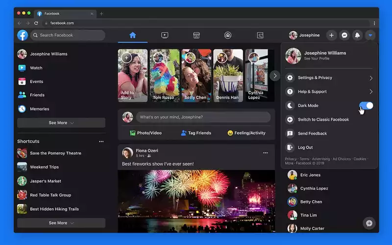
Facebook introduced a dark mode to its website, the biggest visual change in years, and added other features to make the desktop version easier and faster to use
After redesigning the mobile experience, Facebook said in a blog post that it spent months interacting with users to improve the web experience There are three main improvements: dark mode, faster search, and easier management of pages, groups, and events
Facebook has introduced dark mode to the desktop Facebook's goal is to minimize screen glare when using the site in dark areas But it also saves battery power on laptops
At the same time, dark mode puts more emphasis on photos and videos, allowing for a more immersive enjoyment of media Here is how to enable dark mode on Facebookcom
1 go to Facebookcom 2 click on the down arrow in the upper right corner of the page
3 click on the Switch to New Facebook option
4 You will be asked if you want to use the light or dark theme Click the dark theme option
If at any time you wish to toggle the dark mode option, click the arrow in the upper right corner again and a dedicated dark mode switch will appear
The new Facebookcom also offers streamlined navigation The interface makes it easier to find videos, games, and groups In addition, the home page and page transitions load faster, which seems to improve Facebook's overall performance and bring it closer to the Facebook mobile app
The redesigned Facebookcom has been optimized to make it easier to create events, pages, groups, and even ads It also allows users to preview groups they may be about to start in real time, whether on desktop or mobile
Facebook says it will monitor user response to continue improving the user experience








Comments